How Indonesia is using data for decision making
By Pulse Lab Jakarta
Pulse Lab Jakarta and Indonesia's Ministry of National Development Planning develops data visualisation tool to make sense of data.

Image: Republic of Korea – CC BY 2.0
Yet no matter how promising these data sets might be, without the ability to make sense of their complexities in an intuitive and holistic way, the efforts may fare futile for decision makers who often lack the technical data analytics know-how.
To complement the Indonesian Government’s data governance initiative known as Satu Data, Pulse Lab Jakarta alongside the Ministry of National Development Planning (Bappenas) developed a data visualisation tool to provide government officials with an at-a-glance, data informed view on particular development topics. The tool is being tested with potential users within the Ministry for feedback, and will become a cornerstone in the Bappenas’ Situation Room for planning, implementation, monitoring and evaluation.
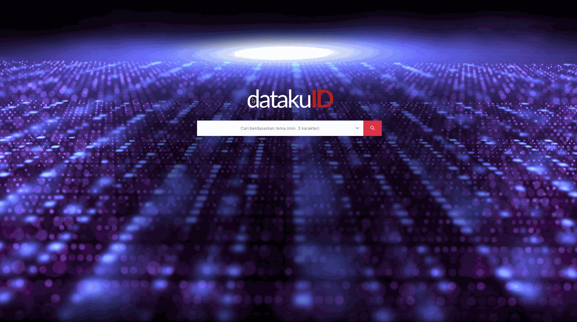
Known as DatakuID, the tool visualises near real-time data that is made available through Satu Data Indonesia portal APIs. Satu Data itself is aimed at improving the quality of data governance within the public sector to better identify the needs of local communities and inform broader public policies.
As part of Satu Data’s implementation, pilot projects are undertaken throughout seven ministries, including Bappenas. Data related to the country’s national development planning agendas are thus streamed in a specialised data portal called Satu Data Perencanaan Pembangunan.
While this portal houses several complex data sets that can be leveraged for effective policy making, making sense of the data often comes as a challenge. To address this challenge, Bappenas’ Data and Information Centre initially explored a few ideas with Pulse Lab Jakarta’s data analytics team, from which insights were garnered that later informed the development of the data visualisation tool.
DatakuID is designed to ingest data from the Satu Data Perencanaan Pembangunan portal, then visualise and present them in an intuitive, concise and attractive format to inform decision making at the subnational and national levels.
Navigating the dashboard
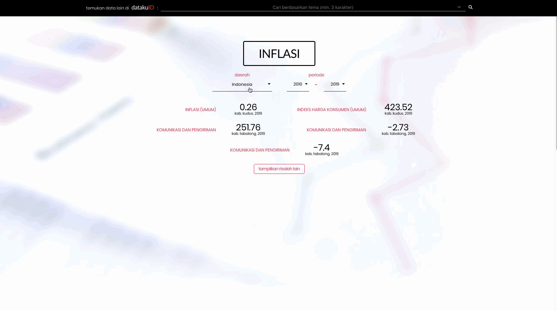
The prototype of the dashboard incorporates statistical data from Statistics Indonesia (Indonesia’s national statistics bureau), which are divided into three main categories: social and population statistics; economy and trade statistics; and agriculture and mining statistics. The dashboard allows users to select from a menu of 33 sub thematic areas, which include inflation, energy, communication, among others.
The dashboard then displays information available on the selected theme in a simple and straightforward way, without having to rummage through years of historical data stored in tabular HTML format. By selecting inflation for example, users can interact with a set of variables (consumer price index is used as an illustration below) for different time periods. Depending on the nature of the data set and the variables selected, the visualisations may be presented in a line, bar, pie or map chart.

While the default is set to display information at the national level, this information can also be filtered at a finer regional level. For users interested in further analysing the raw data, there’s an option available for download but the data is also viewable on the dashboard itself.
The dashboard is designed to accommodate the latter, especially as the data and visualisations are updated in near real-time based on the Satu Data Indonesia portal APIs. In addition, a user can run a general query based on a particular keyword (for instance ‘health’) to get an at-a-glance perspective on this topic.
Finding the right, all-in-one tool to use when working with so many different datasets is always a challenge in itself, but DatakuID strives to balance data density, user understandability and transparency.
Sharing knowledge to ease implementation
As with all innovations, knowledge transfer and capacity building for intended end users are crucial for successful implementation. This is why we always ensure that the end users are involved throughout the entire innovation life cycle from brainstorming to prototype iterations and feedback.
Separate from the time spent working together with our team to develop this data visualisation tool, Bappenas’ Data and Information Centre also organised a series of training workshops to socialise the tool among its staff. In the coming weeks, there will also be a user experience testing workshop for Bappenas’ staff, which will provide an opportunity to explore the tool in all its glory. These workshops are intended to serve as a two-way knowledge exchange between the developers and end users, where questions and feedback are encouraged to help refine the tool and accelerate its adoption.

With its user friendly features, a range of government personnel will be able to use DatakuID. The tool is built with much agility, which makes it adaptable to other datasets that may be added in the future from the Satu Data portal, including datasets from other ministries.
As a data visualisation tool, DatakuID provides a means for decision makers to examine complex development data across the country’s archipelago, through an easily accessible, navigable, integrated and near real-time visualisation platform. We will provide more updates on DatakuID as it gets integrated into Bappenas’ Situation Room which will be launched soon.
This article was reproduced with permission. It was originally published here.